In this series of blogs, The Art of Colour Theory, we will be taking a closer look at one of the most important topics in interior design; colour theory. In the third volume of this series, we take a look at one of the most intimidating colours to use in interiors; black.

Vol.3 – Black
Black is the result of all colours absorbed. It provides protective barriers as it absorbs energy and conceals identity. Black is perceived as a serious and formal colour, with many people also believing that black is slimming, yet it creates the illusion of heaviness. Black is a true classic as it evokes a sense of sophistication and glamour – think the ‘little black dress’ or a formal dinner suit.
Colours also bring to mind certain word associations, which also help determine the use of the colour:
POSITIVE: Security, Emotional safety, Glamourous, Sophisticated
NEGATIVE: Oppressive, Menacing, Cold, Mysterious, Death, Secretive
Black in interiors
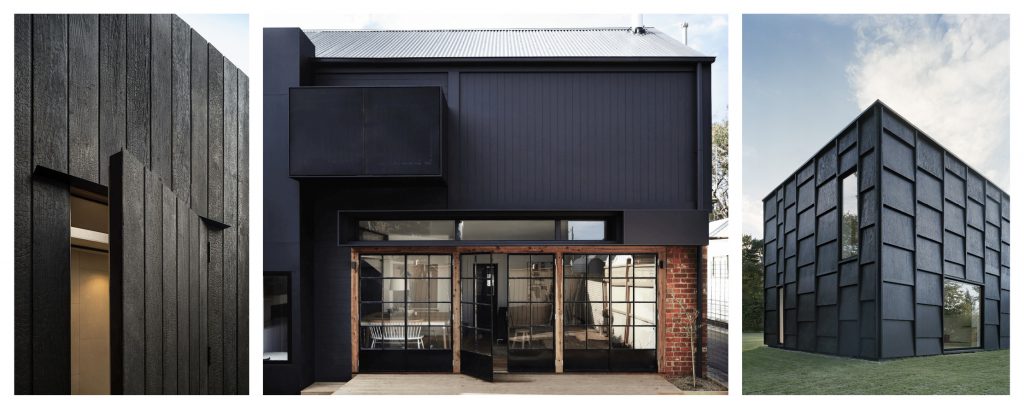
One of the key considerations any interior designer should note when designing a room is the orientation, the amount of natural light available and how to maximise this within the space. It is, therefore, the antithesis of these considerations to design a scheme using black as the driving colour. Black, however, is emerging as the nouveau colour in many design schemes. In architecture, we commonly see black as a part of a building’s structural and design language; charred or stained timber cladding, corrugated steel, or concrete, for example. It is therefore unsurprising to see black finding its way into the interior with clients and designers alike, becoming confident in its use.
The use of black in interiors does not have a common setting, for example, compared to the likes of yellow being best suited to hallways and landings (as noted in The Art of Colour Theory –Vol. 1 blog post). Black is such an under-used colour, that a common association of black in the context of interiors could refer to Gothic design (not to be confused with the Gothic Revival style of the 19th Century). However, this association is somewhat tenuous; Gothic design of the Middle Ages was developed as a way in which to bring more light into vast spaces (commonly cathedrals and churches, but later spreading to the design of castles, palaces and bridges). Spaces designed in the Gothic manner may have an association of being designed with the use of the colour black due to many of these buildings being used as settings in horror movies, or where an imposing, mysterious atmosphere is needed to be created.

Break the rules with black
As the saying goes, “rules are made to be broken” and this is certainly the case with colour theory. The definition of a “theory” is that it is a “system of ideas intended to explain something, especially one based on general principles”. The term general is one which can be applied here. Colour theory is a general principle which many designers refer to, but it does not mean that designers have to rigidly stick to these general ideas.
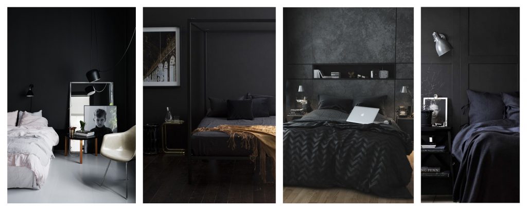
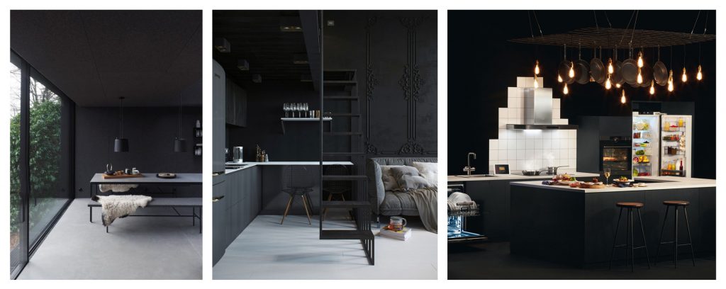
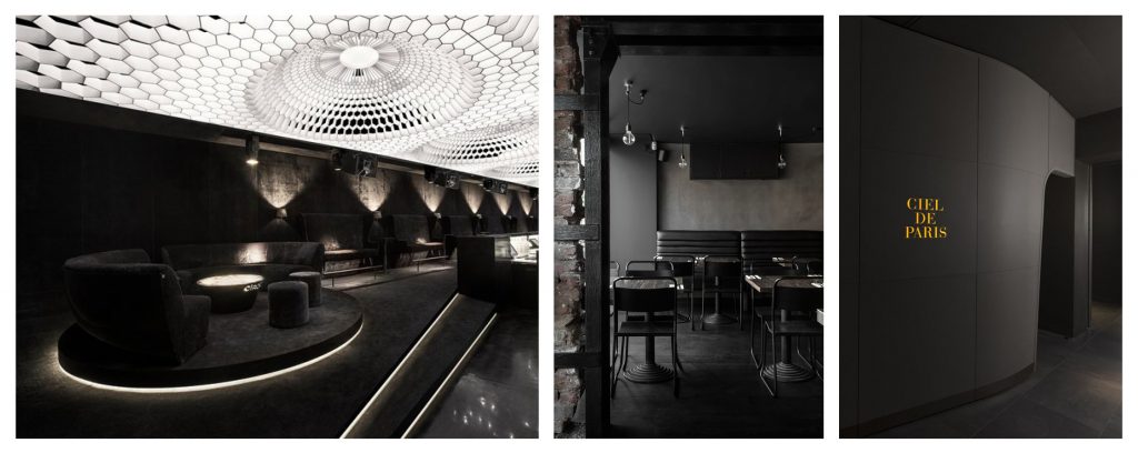
Below, we showcase some of those interiors which “break the rules” and defy the general principles of colour theory and to show just how warm, sophisticated and feature-enhancing the use of the colour black can be within any given interior space.


As we can see through the selection of images, black, in its purest form, can create a sophisticated, dramatic, yet sanctuary-like space. Both used architecturally and in interior spaces, black exudes confidence by the designer and client alike.
Keep posted for our next instalment of ‘The Art of Colour Theory’ blogs – coming soon!
You can also check out the other two previous volumes:
The Art of Colour Theory – Vol. 1: here.
The Art of Colour Theory – Vol. 2: here.


2 responses
superb !! color theory blogs. you made great post and giving to us.
Black is a very flexible colour, it can go with every other colour on the spectrum and is a colour that works great on its own as well. Great for simplicity, and sophistication and also makes it stain proof as well, definitely one of my favorite colors. 10/10
.
.
Also, I’m loving these color theory blogs, very insightful.