Radiant Orchid; it is billed as the colour to spark imagination, help express creativity and exude confidence, yet it seems that Pantone’s colour of the year for 2014 is creating somewhat of a division within the design industry.
Over the past few years, we have seen Pantone go “on trend”. The vibrant ‘Tangerine Tango’ (17-1463) of 2012, feminine ‘Honeysuckle’ (18-2120) from 2011 and last year’s offering, Emerald (17-5641) were all, generally speaking, well-received by observers and designers alike. We could note their importance and influence within the design industry in almost every sector, from interiors and fashion, to graphics and products, it felt as though Pantone had hit the proverbial ‘nail on the head’ year on year.
However, this year is different. This year, it feels as though ‘Radiant Orchid’ has come from nowhere. Reading through a variety of design blogs and commentator remarks, there are of course the supporters out there, but those who feel this year’s choice has missed the mark seem to be more prevalent than I have ever come across. Is ‘Radiant Orchid’ the Marmite of the design world?
When we look back at the collection of Pantone’s ‘Colour of the Year’ since 2009, we can see over the last five occasions that the chosen colours all have a comparable hue and tonal value to them. Yes, they are from different colour families, but their intensity could be considered to be similar. Why is this? One observer commented that perhaps this similarity in tonal value could be indicative of the sluggish economy globally and our hopes for a more prosperous future.
Pantone has a wealth of colour ranges to choose from, so it is somewhat surprising that we find ourselves back in the same place. Why not a pastel colour? How about metallic? Or neon?
Radiant Orchid not only has similar tonal values to what we have seen before, but in interior terms, there is a fine line between it being over-powering and for it to be used cleverly. Again, many commentators suggest that this year, it is more suited to being an accent colour, rather than a dominant, focal one.
However, we all have our own styles, inspirations and opinions, and Radiant Orchid may be the colour for you. Nevertheless, there will be those of us who will find it difficult to get on board fully with this year’s choice; myself included.
To set a trend, we need to analyse all areas of the design industry; we need to look at where we have been to see how we will develop and we have to have one eye on the future whilst another is firmly set on what is happening right now. With that in mind, I have decided to set my own ‘Colour of the Year’ for 2014.
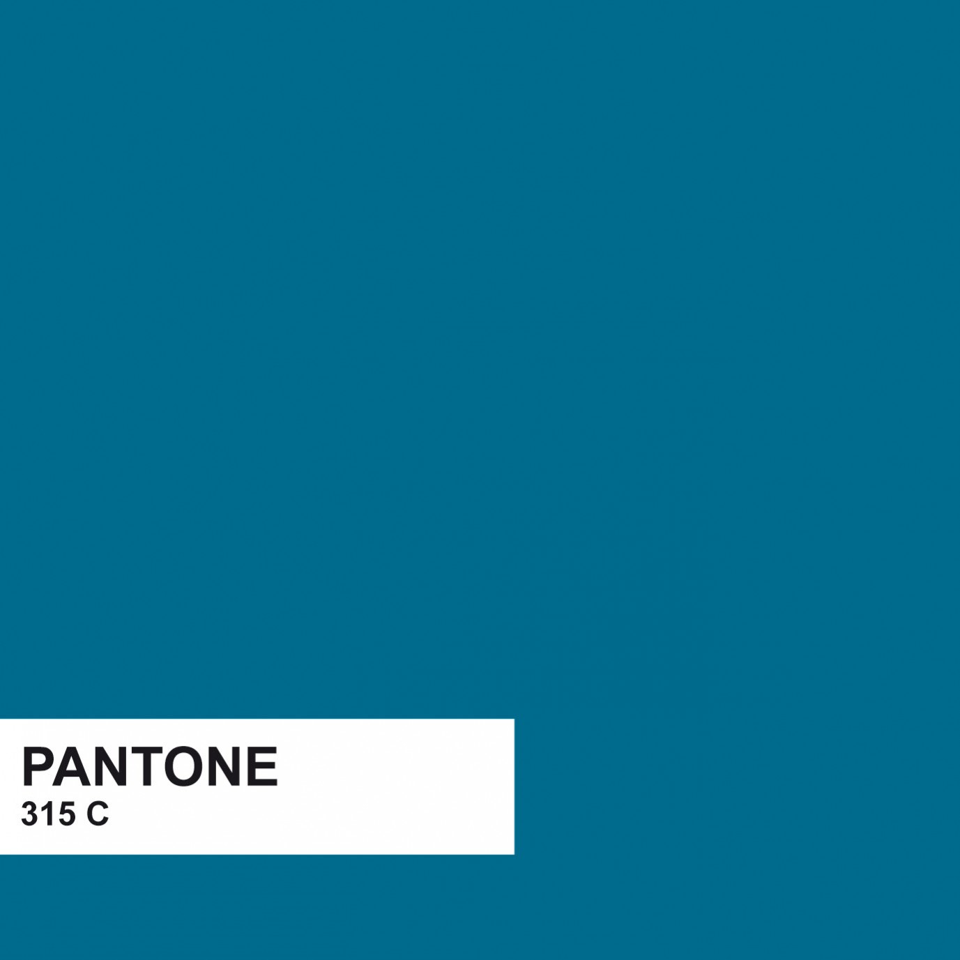
Taking inspiration from all areas of the design industry, reading through journals and blogs, seeing what trends are up-and-coming this year, as well as seeking inspiration from those “in the know”, my colour for 2014 is Pantone 315C.
Turquoise and navy are hugely on-trend colours for this year and we are seeing them shine through all industries, whether this be fashion prints, textiles, accessories or wall coverings. However, Pantone 315C is a much warmer, sophisticated and ever so slightly, Parisian.
So whether Radiant Orchard or Pantone 315C are for you, just remember, it is our job as Interior Designers to help our clients separate the good from the bad, the useful over the useless and always keep in mind, it’s just a matter of opinion.


Images courtesy of:Architecture & Interior Design (2013) Interior Design Library [Online Image]. Available from: http://architectureandinteriordesign.wordpress.com/2013/01/31/pink-feelings-versurs-pink-furniture/ [Accessed 13/01/14].Beverley Hills Home (2013) Fuchsia cushion [Online Image]. Available from: http://www.beverleyhillshome.co.uk/designers-guild-taru-fuschia-cushion-p521967.html [Accessed 13/01/14].
Connections At Home (2013) Fuchsia Magis Puppy [Online Image]. Available from: http://www.connectionsathome.co.uk/blog/2013/09/magis-large-xl-fuchsia-puppy-exclusive-to-connections-at-home/ [Accessed 13/01/14].
For Room (2013) Pompeian [Online Image]. Available from: [Accessed 13/01/14].
Francoise Nielly (2013) Untitled 606 [Online Image]. Available from: http://www.francoise-nielly.com/index.php/galerie/index/47/0/0/+/30 [Accessed 13/01/14]. Francoise Neilly (2013) Untitled 1027 [Online Image]. Available from: http://www.francoise-nielly.com/index.php/galerie/index/0/0/0/+/37 [Accessed 13/01/14].
Interior Clip (2013) Teal Bedroom Elle Decor [Online Image]. Available from: http://www.interiorclip.com/imageres/1920×1440-teal-bedroom-elle-decor/ [Accessed 13/01/14].
Lexon (2013) Tykho Radio [Online Image]. Available from: [Accessed 13/01/14].
Mini Moderns (2013) Whitby Wallpaper [Online Image]. Available from: http://www.minimoderns.com/product/whitby-wallpaper-lido [Accessed 13/01/14].
Nathan Rhodes Design (2013) Replica Xavier Pauchard [Online Image]. Available from: [Accessed 13/01/14].
Niche Modern (2013) Plum Glass Pendant [Online Image]. Available from: [Accessed 13/01/14].
Oriental Weavers (2013) Teal Revival Rug [Online Image]. Available from: [Accessed 13/01/14].
Osbourne & Little (2013) Cariani Ravenna Chenille [Online Image]. Available from: [Accessed 13/01/14].
Polyvore (2013) Boeme Teal Bandana Cushion [Online Image]. Available from: http://www.polyvore.com/teal_home_decor/shop?query=teal+home+decor [Accessed 13/01/14].
Remodelista (2013) Niche Modern Bella Pendant [Online Image]. Available from: http://www.remodelista.com/posts/10-easy-pieces-colorful-glass-pendant-lights [Accessed 13/01/14].
Roost (2013) Replica Eames DAR [Online Image]. Available from: [Accessed 13/01/14].
The Ideal Pad (2013) 1p Stamp Rug [Online Image]. Available from: [Accessed 13/01/14].
Thomas Net (2013) Decorative Lighting Pendants [Online Image]. Available from: http://news.thomasnet.com/fullstory/Decorative-Lighting-Pendants-come-in-jewel-tones-453686 [Accessed 13/01/14].
Utility Design (2013) IITTALA Kivi Light [Online Image]. Available from: [Accessed 13/01/14].
Will & Glory (2013) Stag Print [Online Image]. Available from: [Accessed 13/01/14].


