Are there any interior design features you really hate? From vertical blinds to fish tanks, fairy lights to shabby chic. barely a trend or style goes un-mentioned in Episode 6 of The Awkward Corner as our tutors discussed the design features they truly hate.
DISCLAIMER: If you’ve already listened to this week’s podcast, we apologise. If you haven’t then we’ll apologise in advance!
Listen to Episode 6 NOW
Magnolia
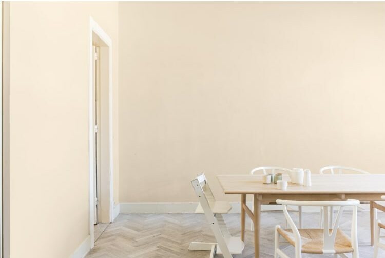
Kicking off the list of design blunders was the “sad, off-white colour”, Magnolia. This neutral colour was dumped into Room 101 unanimously by the podcast hosts. Magnolia has been a popular choice for landlords and new-builds as a safe, easy neutral colour that appeals to a wide audience. There are so many lovely neutral shades now available there’s no excuse for choosing this yellow under-toned dated colour.
The Wrong Sized Rug
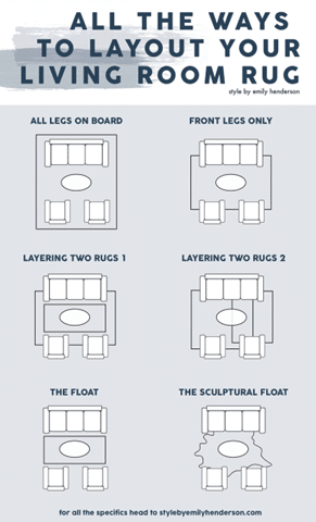
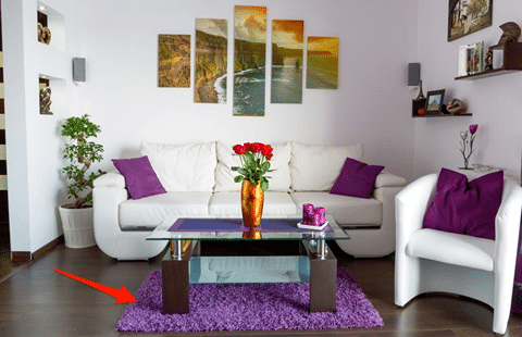
Moving on, SJ raised the idea of the wrong sized rug. Specifically, a rug too small for the room, or alternatively a rug that is as big as, or smaller than the coffee table situated on top. It was agreed that a rug too small for the space throws off the entire proportion and scale of the room itself.
To the left is a helpful template demonstrating various ways to order furniture around a correctly sized rug for the space, ensuring correct proportions and a perfect balance within your room.
How do your rugs measure up?
Vertical Blinds
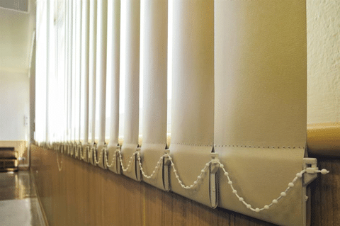
Amy’s dislike towards vertical blinds was third on the list. Should these have stayed in the 80’s? Although perhaps functional, it was agreed that they are an eye-sore in a property today, as well as annoyingly ‘flapping’ when any window is opened. Often used today in an office environment, vertical blinds were said to be a no go within a residential interior, especially when bleached by the sun and stained with the faded haze of yellow that we are all so familiar with. With many other affordable window treatments available today, do vertical blinds still have a place?
The Carpeted Bathroom
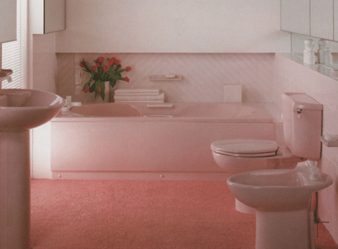
Another design-fail of mutual agreement, was having carpet in bathrooms. It is hard to see beyond the unhygienic qualities having carpet in this space possesses, but believe it or not, it was once a trend in the 1960s and 1970s. The idea was initially to make the bathroom more of an inviting and comfortable space, however, the cons appear to outweigh the pros. The moisture build-up from the steam and water can create the growth of mould and potentially fungi, this creating an unhealthy and unsanitary environment in what should be the cleanest room in the house. This is without even considering the aesthetics of this old-fashioned trend .
Wallpapered Furniture
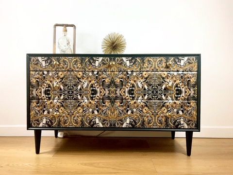
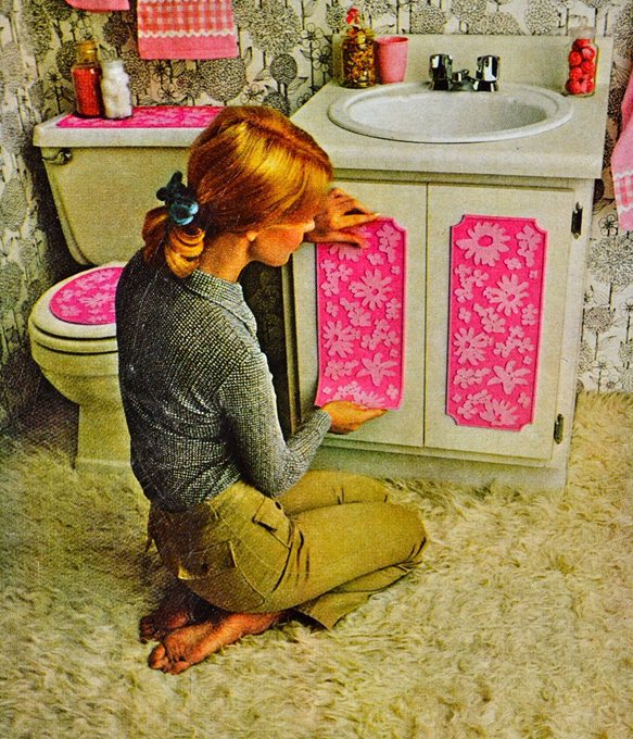
One idea that sparked a debate amongst the hosts was wallpapered furniture. An interesting concept that is a way of adding texture and pattern into a space. The general consensus was that if done well, it could work, however a DIY approach may not have the same effect. Stephen passionately defended it as a tasteful way to customise and personalise a piece, whereas Molly and Amy both put wallpapered furniture into the ’shabby chic’ bracket, alongside distressing your own furniture. Has furniture customisation had its heyday? Is shabby chic so over? Have your say in the comments or over on Instagram.
Fairy Lights & LED Strip Lights
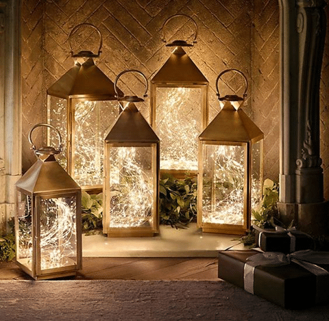
A trend that commonly features in shabby chic interiors, placing fairy lights in fireplaces, alcoves, bottles – basically anywhere! This trend really got to the tutors. Is it decorative lighting? Or is it just simply over-decorating? Fairy lights definitely have a place, depending on the season and also the target audience – for example children’s bedrooms but should they have a place in your lounge? Definitely not, according to the team.
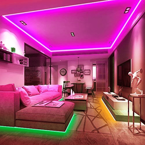
LED lights are also increasing in popularity thanks to their cost effective operation and ease of installation. They can be used to highlight certain aspects of a space and can create a playful atmosphere, especially if colour-changing. The question is if they are contemporary or just garish? Again – have your say on our social media feeds.
Diamonds, Glitter & Fluff
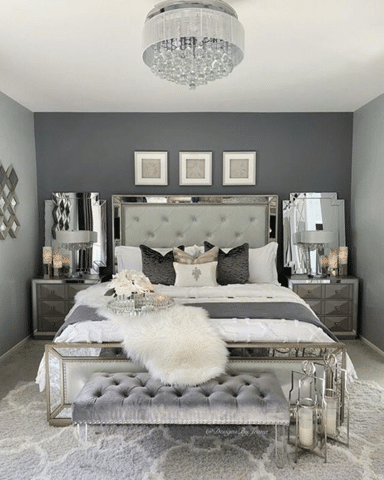
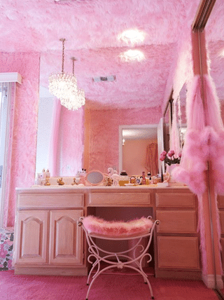
There will always be products and a market for ‘glitter, diamonds and fluff’. Unfortunately, none of the podcast hosts will be consumers. It was in complete agreement that glittery, fluffy and bejewelled items belong off the shop shelves and into Room 101. As Stephen stated in the podcast, it is a ‘considered look’ that attempts to achieve a high-end interior design aesthetic, however, it appears to do more of the opposite. As Ludwig Mies Van der Rohe once famously said, “less is more” – something which should definitely be applied to this interior design style.
Colour-Coded Bookshelves
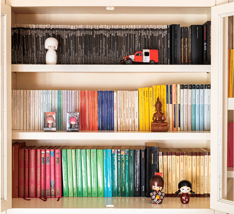
Another contentious topic on the podcast was colour co-ordinating book shelves. The idea of having books for visual impact alone, instead of having them as a collection of our identity, personal time capsules and research tools, was not welcomed by Stephen, Amy, SJ or Molly. Some may argue that structuring your bookshelf in such a way may enhance the overall organisation and act as a logical system. Others see this as a way of utilising books only for decorative purposes and therefore, stripping the importance of books themselves.
Regardless of how you feel about this interior design trend, there is an interesting article on this topic linked below, where the ideology of colour co-ordinating our books is explored. “There’s a reason that when we are in someone’s house, we’re curious about what’s on the shelves—because we’re wondering who they are,” – Christy Shannon Smirl, owner of Foxtail Book says. With that being said, does it really matter?.
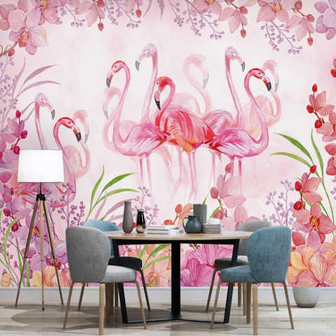
Some of the design features sent to ‘Room 101’ may be a little contentious. Your home may be filled with little quotes or fairy lights. Your home interior is personal. There are no rights and wrongs if you love it. That’s the wonderful thing about interior design – creating schemes for different personalities.
Do you have a most hated interior design feature? Do you want to defend any of the design styles in this blog? Have your say over on our Instagram feed or Facebook page.

