Written by NDA tutor, Amy Payler-Carpenter
Like it or not a designer’s year will be dominated with the highs and lows of the latest trends. Each year will see styles which fly of the shelves and those that flop. It can be difficult to keep up so here’s a rundown of what is going to be hot this year…
Matte Black
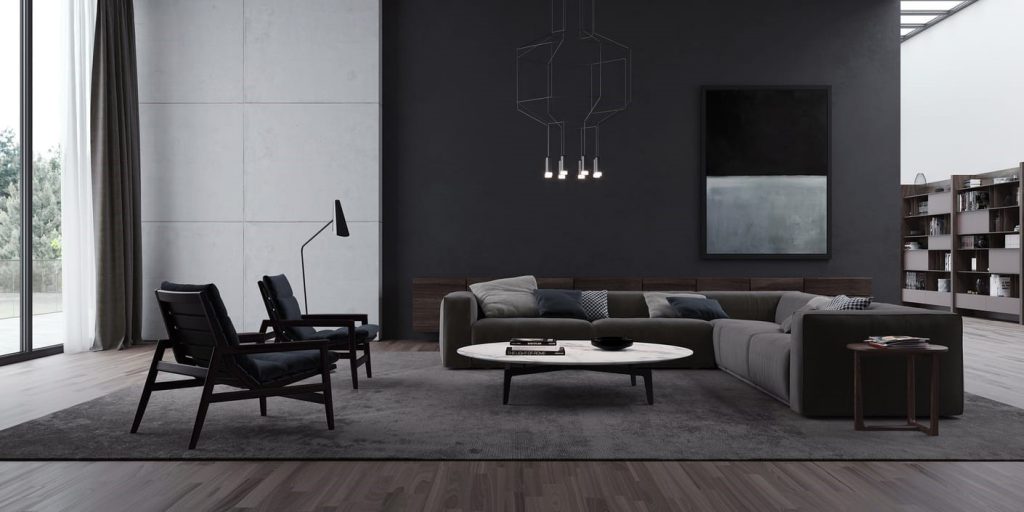
We saw the popularity of matte colours rise in 2018 as a rebellion to the glossy finishes which dominated 2017. This trend is set to continue, with matte blacks at its forefront. Within an interior, used for walls, floors and furniture, this trend can create urban luxury and a sense of simplicity, which according to Homewings, the online design platform, will be most popular in The Midlands.

Poliform, Render by Panoptikon
The visual above created by Panoptikon shows how a mix of textures ensures that not all the light will be absorbed, giving the scheme a sense of depth. Using this trend with too much vigour will drain a space of light, so mixing it with lighter shades, a grey wall, and reflective surfaces, a polished floor, will lift the space.
Matte black bath, Designed by Lusso Stone
Weave
Weaved finishes have been popular within interior design for decades, whether it be the macramé hangers of the 70’s or the rattan patio furniture of the early noughties. In 2016, chunky weaves and knits saw a resurgence, and last year the use of wicker and canes popped up in homes around the country. This year it is not the material that is important, instead, it is the finished look and texture recreated by the intertwining material.
1950’s Sofa with Viennese Weave available from Pamono
Interior trends take inspiration from the past, and this means that these, just like fashion styles, will be seen time and again. Pamono, a furniture and accessories company who specialise in vintage designs, know this well and travel the world collecting classic pieces depending on what is forecast to be popular in the coming year.
Contemporary Weave, part of the Woven Easy Collection by Alexander Mueller
The Seventies… Again
Every couple of years sees the reintroduction of clashing prints, irregular shapes and an overall sense of fun injected back into our interiors. Seventies design means something different to everyone, it’s the carpet in your grandmother’s house, it’s the dinner plates at a party, it’s THAT dress, and this is why as a trend it is and will continue to be, ever popular. There are so many layers to seventies design, but in 2019 the seventies mean BOLD.
Inside Henning Stummel’s Tin House
Marcante Testa, comprised of Andrea Marcante and Adelaide Testa, is an Italian based interior architecture and design firm with an aim to be ‘serious and fun, authentic and refined’. Creating beautiful interiors, which take their lead from designs of the past, elegantly retold for the modern market. Their apartment in Milan uses bold pops of colours, as seen in the visual below, alongside large prints to create a cohesive and continuous thread throughout the space. You can also see the combination of trends here with the appearance of a weaved screen used to divide the dining and living areas. This creates privacy whilst maintaining light levels, which is one of the main features of the space as a whole.
3D visual of Apartment in Milan designed by Marcante Testa
Apartment in Milan designed by Marcante Testa
The Scalloped Shell
In a time when consideration for the environment is at the forefront of design, shapes taken from nature continue to be influential. This year will see the use of the shell used across wallpaper and fabric design, as well as furniture and accessories, much like styles seen during the Art Deco period. The shell has been a symbol of pilgrimage, fertility and femininity, think The Birth of Venus by Botticelli, for centuries and can bring elegance and softness to a space.
Jarrod Lim designed Chair
Kyoto Pillow Covers by Serena & Lily
This is a trend that can be used as little or as much as you like. You can introduce it on a budget or spend more on statement pieces such as the Jarrod Lim chair. This trend also encompasses fish scale designs, which has been linked to a concern over the health of our oceans, known as the ‘Blue Planet Effect’. So whether it be shells or scales, this trend has something for everyone.
Nudes
There is a pattern within colour trends, which without fail seems to follow the same formula year in and year out. It goes a little like this:
- Year One; leading colour experts identify a bold colour palette for the year ahead. Those averse to these colours push a more neutral agenda.
- Year Two; having identified the popularity of the slightly more muted colours, the leading experts release their colours of the year…and guess what? We are left with ‘warm neutrals’ or Dulux’s colour of 2019 ‘Spiced Honey’
- Year Three; BOLD IS BACK as a rebellion to the neutrals of the year before.
And so this continues. This is not unique to colours, patterns, for example, follow a similar format. One year bold prints are popular and as a rebellion against this, the following year is filled with delicate botanicals. This year’s nudes are influences by pink, possibly a knock on effect of Pantone’s colour of the year ‘Living Coral’.
Jotun Lady’s Urban Living colour palette
Julianne 3 Seater Velvet Sofa in Blush Pink available from Made.com
The dictionary definition of trend uses the term ‘general direction’, by nature this is not an exact science. Trend forecasters can make mistakes, likewise, trends can emerge that no one saw coming. Trends are also subjective, what you like might not be to everyone’s taste. Equally, what your client likes may not be to your taste. Regardless, trends cannot be avoided, so you may as well just go with it.


One Response
Thank you for taking time to write Interior Trends 2019.
I think Matte Black & Matt Black with a minimal shean alongwith shades of grey has always been very versatile for applications.
Architects like Tony Chi has used it effectively many times in the past.
The idea of using strong accents in a neutral space always resurfaces as a trend as it’s very effective when used creatively.
I like the idea of modern and contemporary application of traditional objects, forms etc.
Enjoyed the article. Keep writing more
Thank you