In this week’s episode of The Awkward Corner you were warned not to lick the exhibits as Stephen, Amy & SJ entered into the fabulous world of exhibition design. In the latest accompanying blog, Amy looks at some of the best exhibitions created by some of the most talented designers, as well as at the origins and complexities of Exhibition Design. Read on or listen to the podcast below.
Listen to The Awkward Corner
What is Exhibition Design?
The definition of an exhibition is “a public display of works of art or items of interest” however this week we discuss how much more exhibition design entails and how this might progress as technology does.
A good exhibition should tell a story; whether this be a concept, idea or physical object. A narrative is created which explores a subject or individual from an educational or cultural perspective. It is the job of the exhibition designer to ensure that the exhibit is received in the way in which it was intended. There are many layers to exhibition design, these include:
- The physical presentation of the objects or ideas on display; how is work mounted or organised? How is it explained?
- The target market; who is the exhibit aimed at? What do they do? What experiences might they have had which will change the way in which they perceive the exhibition?
- Experience of the visitor; can they interact with the exhibition? How will they be guided through the exhibition to ensure maximum impact? Will the exhibition trigger the senses and if so which ones?
- What secondary elements need to be included to support the primary exhibit? Will there be written and/or audio elements? How can users of different abilities and needs be given the same experiences as an able-bodied user?
- Technology; how will light and audio-visual technology enhance the subject? What new technology is available to help with the interactivity of exhibition?
One of the big questions this week was what comes first, the art and objects or the space, and this really depends on the setting.
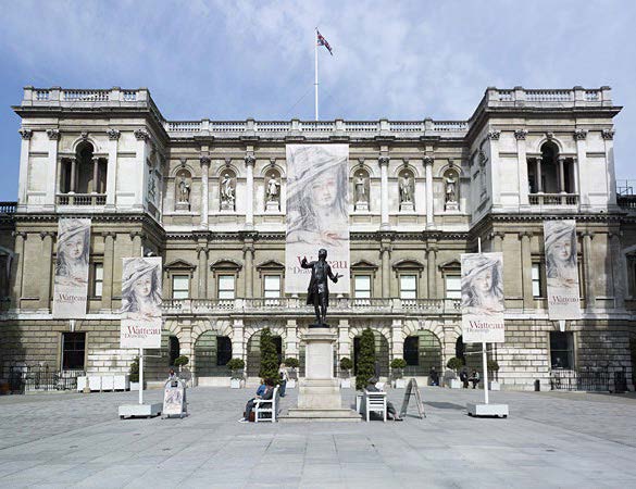
The Royal Academy, London UK.
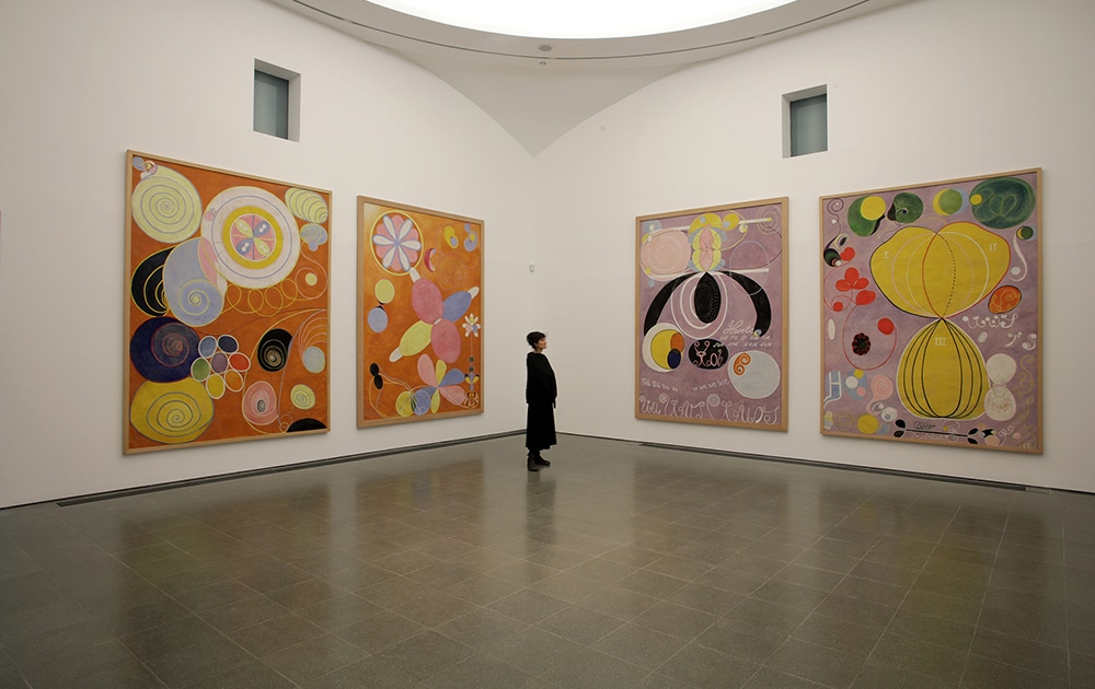
The RA was founded in 1768, by architect Sir William Chambers, after petitioning George III for permission to “establish a society for promoting the Art of Design”. In 1775 Chambers was commissioned to design the new Somerset House. This was a purpose built space, unlike Burlington House where the RA moved to in 1867, which was first and foremost a home, albeit a very grand one. There are limitations with a Grade II* building, and the architecture itself will set the tone.
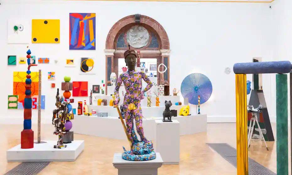
This image of the Summer Exhibition 2021 demonstrates how contemporary art works within the context of the existing architectural features. The walls however have been stripped back to allow the colours of the works to stand out, having the visual impact intended by the curator.
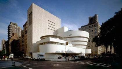
The Guggenheim, New York.
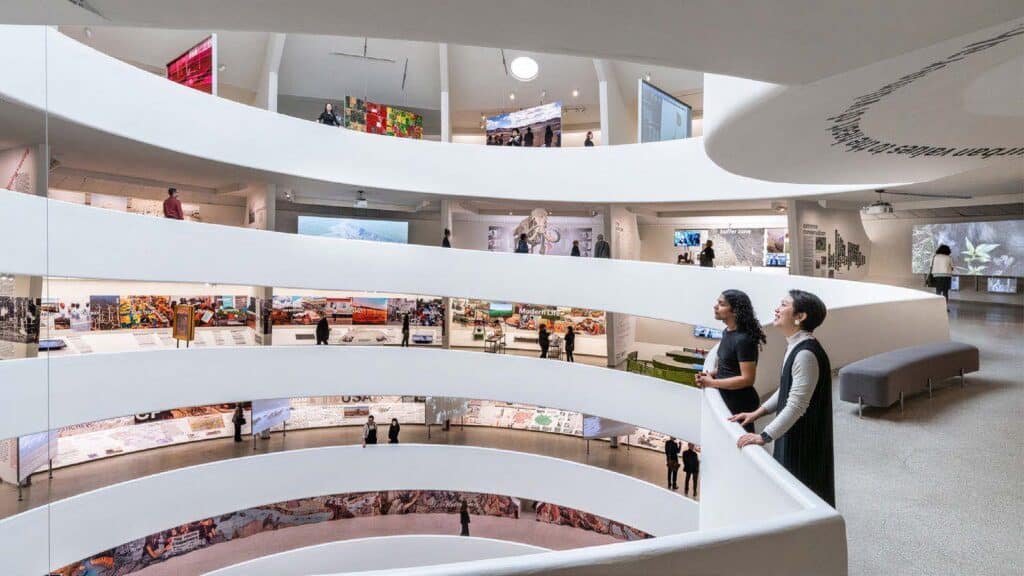
Unlike the RA, The Guggenheim collection in New York is housed in a purpose built 1950’s structure designed by renowned architect Frank Lloyd Wright. The space was designed with modern and contemporary art in mind, meaning from the initial concept stage this was front and centre in Wright’s mind. However, the strong internal forms still have an impact on the perception of the art which is being exhibited, and the journey of the visitor is set out from the start with the spiral walkways leading top to down. This means curators must consider the existing space whilst planning any exhibition.
What is a Curator?
A curator is someone who is responsible for a collection at a museum or gallery. Often acurator will be in charge of building a collection in a specific area. There is some crossover between a curator and exhibition designer, and it is important that regardless of job title you have a working knowledge of both. An exhibition designer will be thinking about the physicality of a space, but will also consider the context of any permanent exhibitions or ethos of the organisation, ensuring the appropriateness of a design.
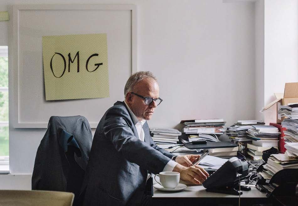
Hans Ulrich Obrist is the Artistic Director at the Serpentine Galleries, London. He is a curator, critic and art historian who has written many books on the topic, including Ways of Curating and A Brief History of Curating. In interviews he has discussed how as a child he would collect postcards everywhere he went; he would then arrange the postcards on his bedroom wall and this, he says, was his first foray into curating. This, in its basic form is what curating is, and as good a start as any.
The Senses
One of the contemporary arguments in exhibition design is how visitors can be given an experience that is truly immersive. One way being explored is through the use of the sense; Ellen Lupton, writer, curator and designer, argues in her 2017 TED Talk, Museums should activate multiple senses, not just the eyeballs, that the practise of only using our eyes to experience art is outdated, and explores other ways in which the senses can be used to enhance. But how do we do this?
“Museums should activate multiple senses, not just the eyeball”

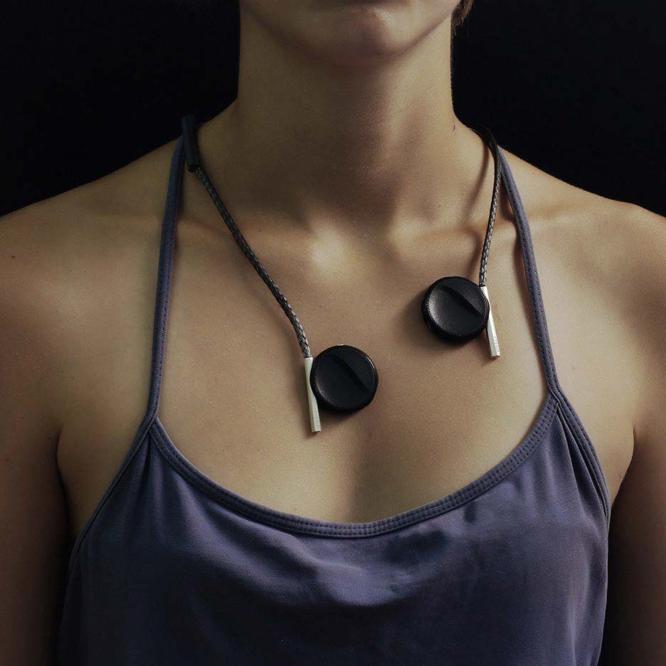
Liron Gino, a Bezalel Academy of Arts and Design graduate, developed a jewellery-like device that vibrates allowing those who are deaf or hard of hearing to experience music. This type of technology could revolutionise the way in which the hard of hearing would experience part of an exhibition from which they were traditionally excluded.
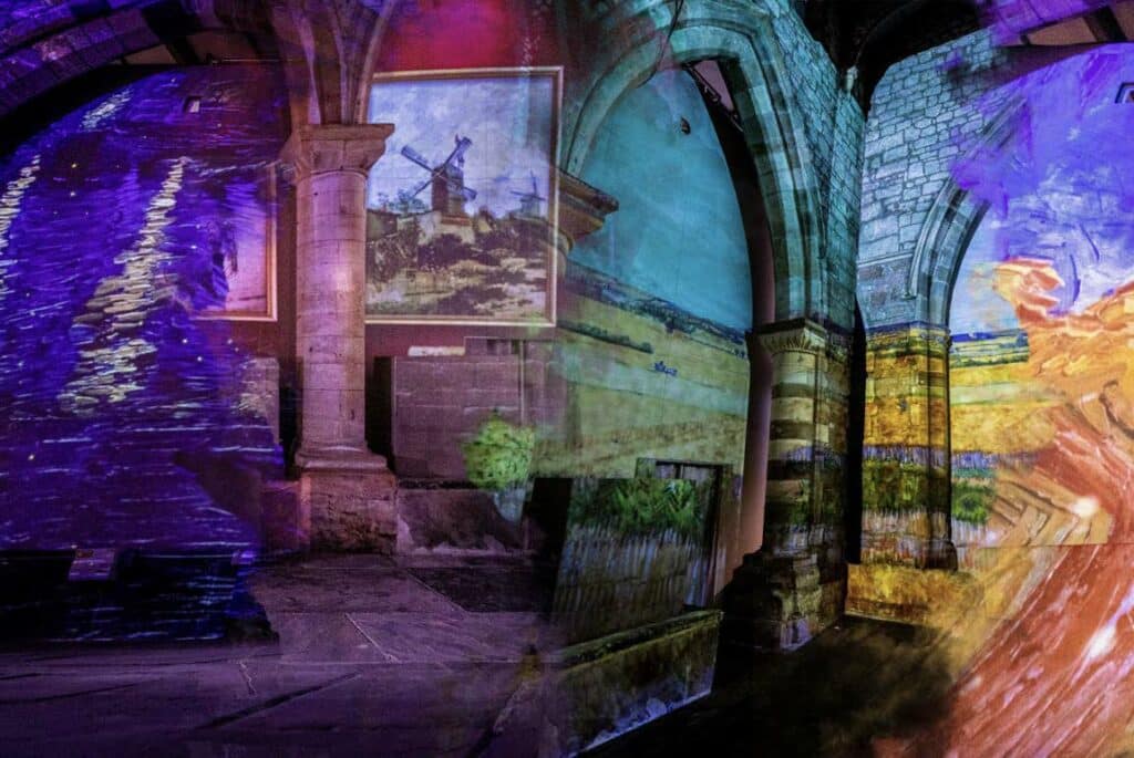
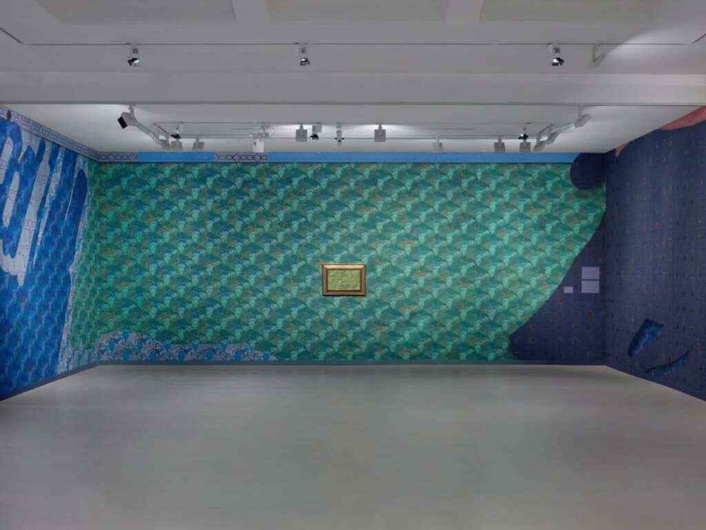
Laura Owens, American artist, explored the idea of bringing art to life by creating Vincent van Gogh inspired wallpaper, using 7 of his paintings. This wallpaper was then used to cover the walls of the Fondation Vincent van Gogh Arles, France, alongside the 7 original paintings. The idea was to create an immersive experience, by ‘stepping’ into the famous scenes. By doing so, the visitor has ‘real-life’ experience of a, normally, flat canvas. This perhaps makes the idea of art more appealing to those who find the magnitude of a prestigious piece of art on white walls inaccessible, and even intimidating. Regardless of what you think about Owens’s work, anything that gets more people into galleries and museums is fine by us!
Influential Exhibitions
As creative people, we all have memories of exhibitions which have stayed with us, and in some instances influenced us. This week we discussed a few notable examples, but we would love to hear from you, please leave a comment below or email us at awkward@nda.ac.uk if there are any exhibitions that you would like us to discuss in future episodes.
Alexander McQueen - Savage Beauty
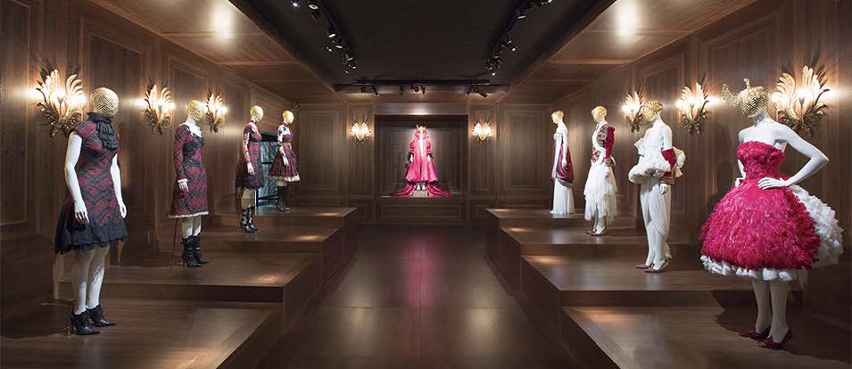
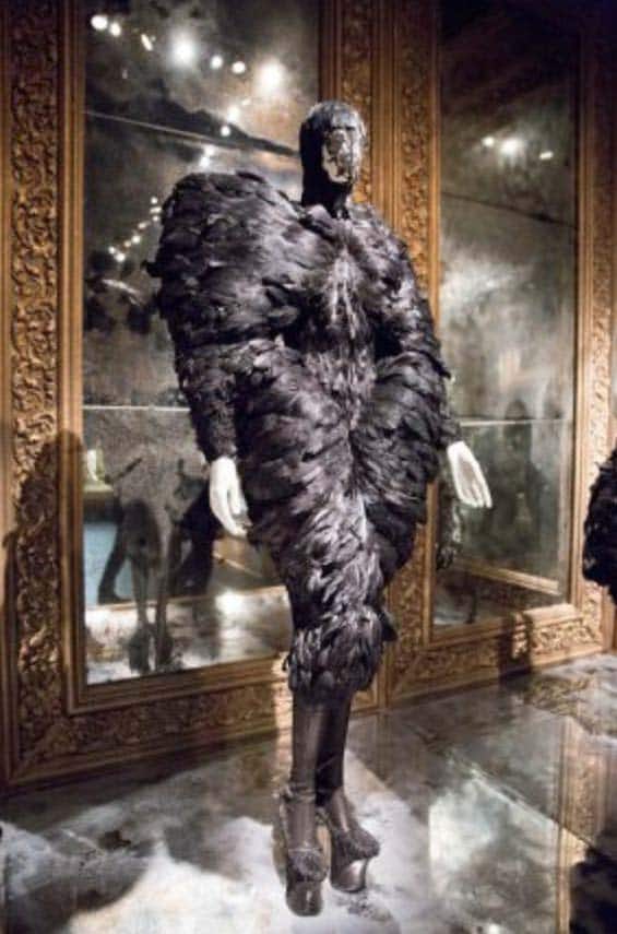
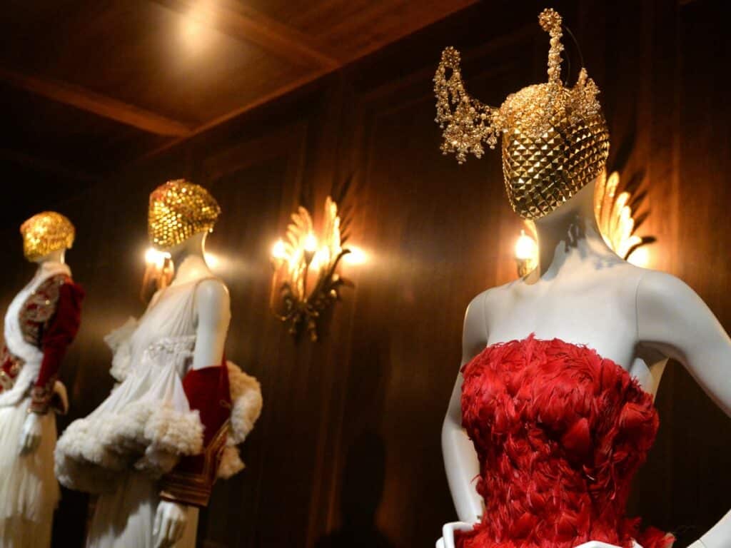
This 2015 posthumous exhibition is one which really left its mark on SJ. Taking place at the V&A, in London, the city of McQueen’s birth, this showcased some of his work through the concept of the notion of genius and madness being one and the same. As Aristotle once said “No great genius has ever existed without a touch of madness” and McQueen even described himself as a “romantic schizophrenic”. This was as much as a performance as it was an exhibition, with the backdrops reflecting the style of the collection. For example, the Victorian Gothic collect, which McQueen once compared to Edgar Allan Poe’s work, could be seen in a hall of degraded mirrors, creating a beautiful yet decaying gothic atmosphere.
Gunther von Hagen – Body Worlds

Body Works, the controversial exhibition by physician, scientist and inventor Gunther von Hagens is one Stephen regrets not going to see when he had the chance. Although for those of you living in Germany and Austria, you may still get the chance, as the work is still being exhibited. However, this comes with a warning, because this one is not for the faint of heart. It explored the human body like never before, using real, donated human bodies as a tool for education. One of the key techniques used here is plastination, developed by Hagens, as a way of preserving the human body. Regardless of your views, this is definitely someone who pushes the boundaries and asks us to question the norms of exhibition design.
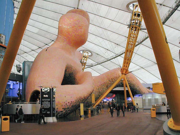
Millenium Dome
For me, one of the most influential exhibitions visited was similarly relating to the human body. The ‘Body’ was one of 14 areas within the Millennium Dome, and featured a giant, anatomically correct, to scale, model of the human body, which allowed you, the visitor, to journey through. The Millennium Dome was a purpose-built exhibition space, built to celebrate the turn of a new millennia. It was controversial, in its design and cost, but hugely successful in terms of the experiences it provided. Designed by Richard Rogers, although the permanent exhibitions are long gone, the space is still used for temporary exhibitions and music venue, which is a staple of the ever-developing London skyline.
AR v VR – The future of Exhibitions
One of the key developments in exhibition design surrounds AR and VR technologies. AR or Augmented Reality adds digital elements to your surroundings, whereas Virtual Reality (VR) is a totally immersive experience, utilising tools such as headsets. A QR code at an exhibition might be used to add an animated aspect, thus making it interactive through AR technologies.
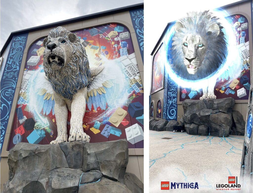
(Images Amy Payler-Carpenter)
AR technology is a great way of getting children enjoying exhibitions. This is demonstrated by the use of AR at LEGOLAND’s new Mythica area at the Windor Resort. And it’s not just kids that enjoy this level of interactivity, we thought it was pretty cool too!
VR technology by still be somewhat limited in this context, however moving forward does this mean that we could enjoy exhibitions at home through the use of headsets? The possibilities are endless, and could mean that more acquisitions could be on show, regardless of physical space. Did you know, for example, that only 0.4% of what the British Museum own, is actually available to see? We have discussed the positive health benefits of viewing art in a previous episode. Could VR be a way of widening participation, positively affecting our mental health and ensure important historical objects are not lost forever in storage?
Blurring the lines between reality and virtual reality, the van Gogh experience, uses virtual projection, unlike Owen’s who used physical print, to allow the visitor to immerse themselves in the famous paintings. The exhibition guides you through the experiences of van Gogh whilst staying in a convent, recovering from a breakdown. Personal letters written to his brother at the time have been used to inform the imagery, light show and music, used to evoke similar feelings to that of the troubled artist.
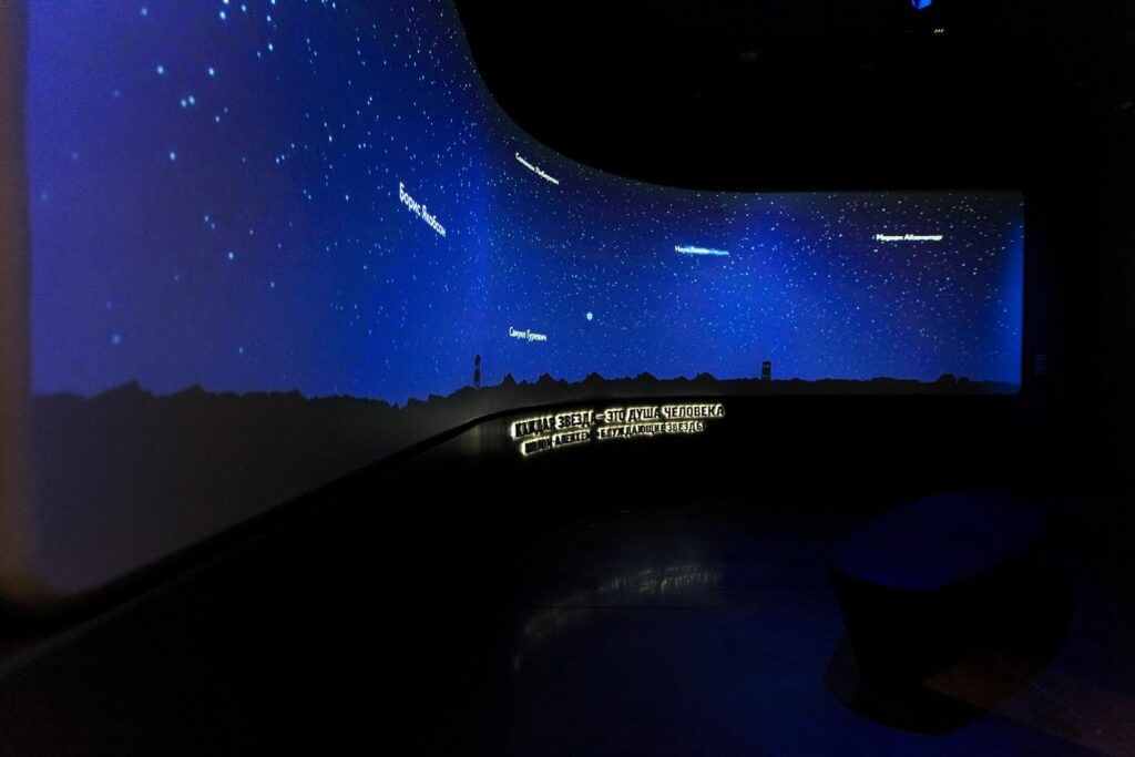
Finally, leaders in experiential design, Lorem Ipsum, create narratives using a modern technology and immersive media. Their goal is to educate whilst being authentic to the theme, something which was incredibly important when designing for the Jewish Musuem in Russia. It is not just exhibitions that Lorem Ipsum focus on; they explore retail, leisure and hospitality in the same way, marrying the physical with the digital to create an unforgettable experience for all those visiting and working in these somewhat futurist spaces.
It is clear from this week’s discussion that we are all looking for something different from our exhibition spaces, making the job of the exhibition designer very hard indeed. However you choose to consume your art, history or cultural information, next time you visit a gallery or museum, take a second look, not at the exhibits but at the space which encapsulates it.
