Choosing a colour scheme for your home can be tricky. What if you get it wrong? What if you spend all that time and money and hate it? Over the next couple of weeks, our Design 101 series will feature tips from expert designers, colour practitioners and links to the best tools of the trade to make sure you get your colour scheme right first time. This week we’re looking at the best apps and websites to help you create your next colour scheme.
Getting Started
Not everyone has an eye for colour or confidence choosing which colours will work together but that doesn’t mean you have to stick with boring neutral tones. Perhaps you’re overflowing with inspiration? Sometimes you can have too much of a good thing. You need to have a starting point. Whether that’s a piece of artwork which will be in the room, a sofa which is too good to replace or a feature in the room which needs to be enhanced or diminished, if you don’t work with what you’ve got your final scheme could end up looking mismatched and tonally awkward.
Whether you’re an experienced home renovator or need a little help getting started, there are tons of tools out there to help you create a colour scheme unique to you and your home.
Understanding Colour Schemes
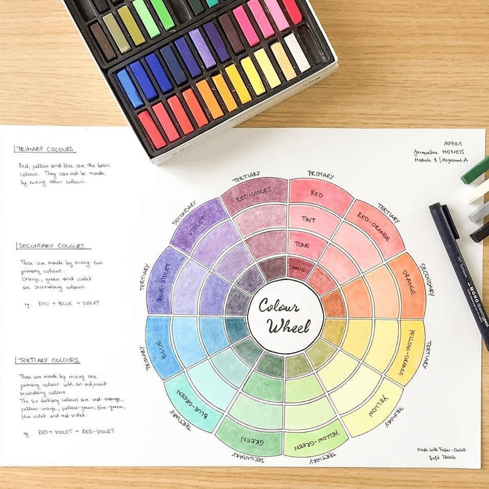
Colour schemes are combinations of colour which work together to create your finished mood. Unless you’re an ultra-minimalist and go the white sofa, white walls, white carpet route, your chosen colour scheme will underpin the success of your next home decorating project.
Colour Theory is one of the first things our students study on the Professional Diploma in Interior Design. It’s also probably the most popular unit we teach. Who doesn’t love painting colour wheels and looking at gorgeous colour schemes? But the complexities behind colour and how it works is a science, as well as an art. In next week’s blog we’ll look at colour psychology in more detail as well as choosing textures and patterns. But for now, we’re focussing on the best apps for choosing a colour scheme in your home.
Adobe Color
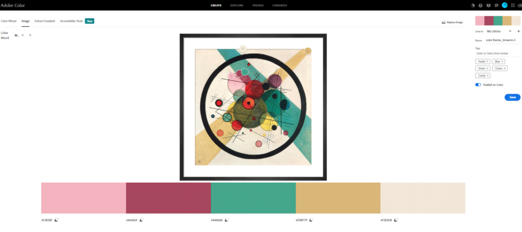
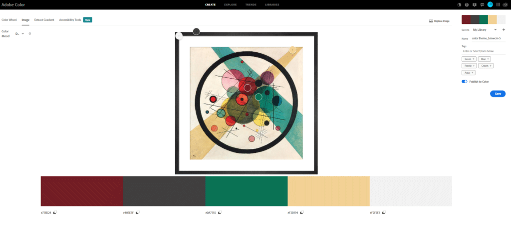
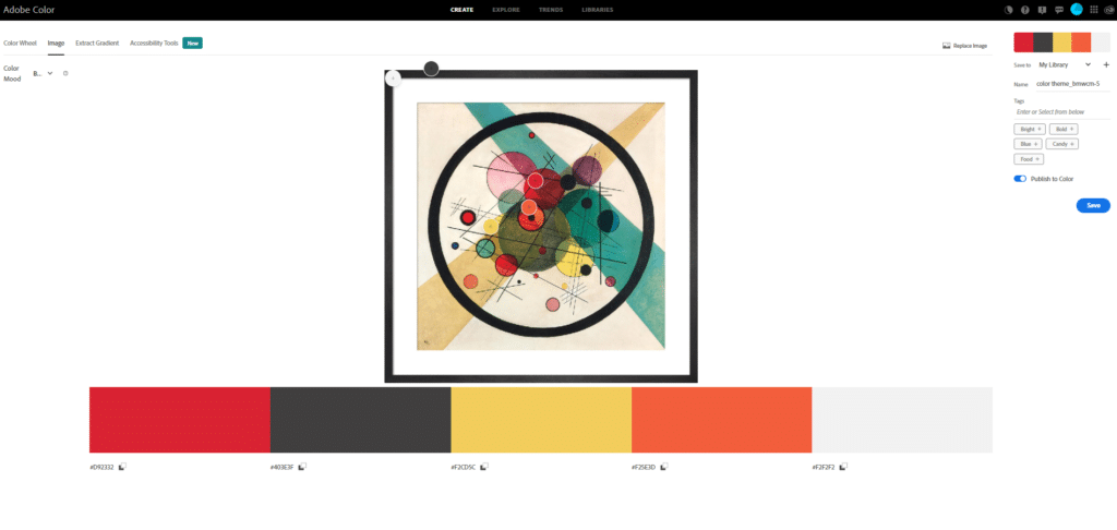
Taking your colour scheme from a favourite piece of art can be a great place to start and there are some very handy apps out there is you aren’t all that confidence picking colours. We used Adobe Color and Wassily Kandinsky’s Circles in a Circle for the next example. The ‘extract theme’ tab allows you to upload an image and then generate a colour scheme based on colours in that image. It then provides you with different colour palettes depending on the mood you want to create.
Coolors
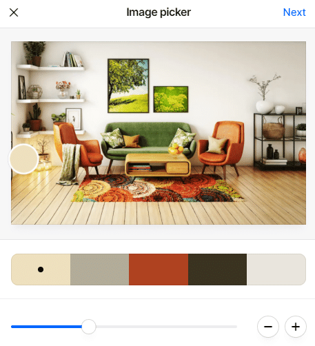
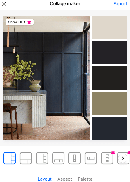
Coolors is a great website which generates colour schemes by either uploading an image or asking it to randomly generate a palette. You can also create a collage of images to create a simple moodboard. We love the random feature on Coolors. Just press the spacebar to generate a new colour palette with every press! Instant inspiration!
You need to sign up to the pro version to get the Hex colours on your collage but these aren’t needed unless you’re planning on creating digital renders of your scheme. You can also save the images and open using another image manipulation tool and use the colour picker or click on the left panel and select each colour individually.
Scroll to the bottom to find out more about converting digital or Hex colours into paint colours.
Dulux Visualizer

The NDA SkillsLab is another great resource for helping you to choose a colour scheme. In a recent tutorial, Creative Director of Dulux, Marianne Shillingford, talks about creating a colour scheme the traditional way – using a colour chart and whatever existing features you need to match in the room. She also introduces the Dulux Visualizer app which has some great new features since we filmed the video.
The Dulux Visualiser lets you choose from over 1200 colours as well as provides ideas to help get you started. You can upload a photo of your own room and then download the colours schemes you create as a video or photo.
Colour Snap
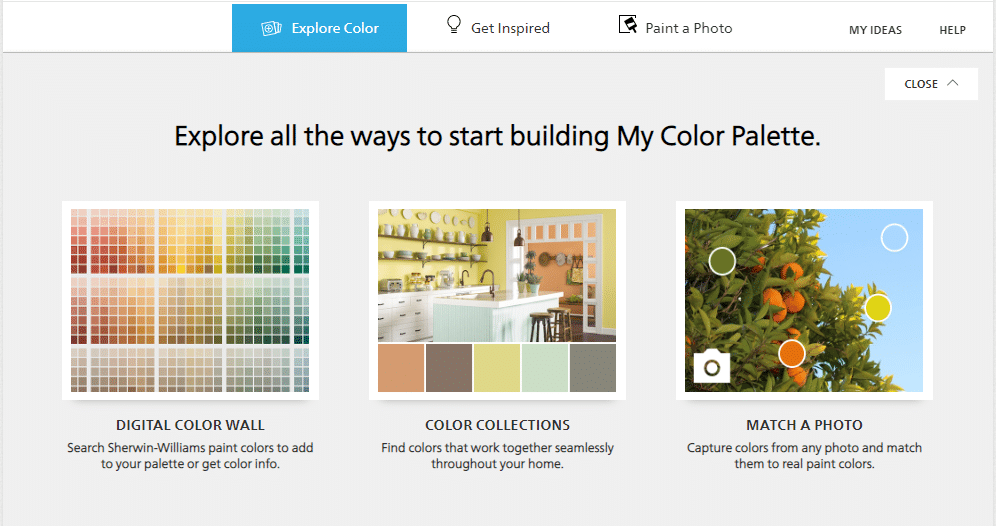
ColorSnap is another visualising tool for interior colour schemes. Developed by Sherwin Williams, you can either explore a colour, ‘get inspired’ or paint a photo. The Explore section gives you a digital colour wall, colour collections (their own palettes) or allows you to pick colours from a photo. The inspiration section has a range of expert colour picks, palettes from inspirational photos and a collection of ‘painted photos’ or rooms which have had different colours added. Paint a Photo is more similar to the Dulux app where you can use the visualising tool to pain one of their stock images in the colour of your choice, or upload your own photo and try out different schemes.
Colourlovers.com
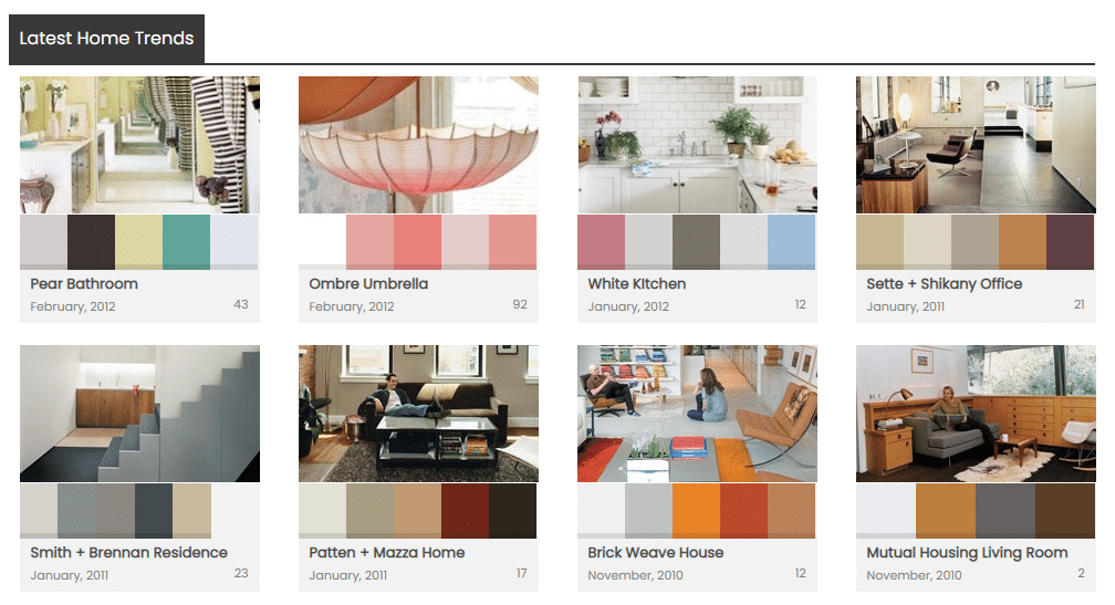
COLOURlovers is a collaborative community where people share colours, palettes and patterns based on different sources of inspiration. Used by web designers, home renovators and just general colour geeks, the platform allows you to add your own vectors, colour palettes and shapes. The interface is more like a forum and a bit outdated but there are still some good ideas. Nearly 10m people actively use COLOURLovers so expect a mix of good and bad! The Home Trends section is by far the most up-to-date part of the site.
I've chosen a colour scheme. What's next?
Next you actually need to find the products you’ll use to create your finished look.
If you’ve used a colour scheme app from a paint manufacturer, like Dulux’s Visualizer or Sherwin Williams ColourSnap, finding your paint is easy – it will tell you on the app what colour or product number you need. Of course you don’t have to buy from that manufacturer but it’s the best way to get exact results.
Colour matching services can offer good results on paler shades but it can be a false economy. Almost all colour matching paint services start with a white base. Pigments are then added but the white base will always remain. This means that any dark shades will always be slightly lighter and less pure than you would find from the original paint manufacturer. Red for example will always be slightly pink.
If you’ve used a different app such as Adobe Color or Coolors, you’ll need to convert your digital colour palette into a physical one. Again, there will always be slight differences but here are some of the best tools –
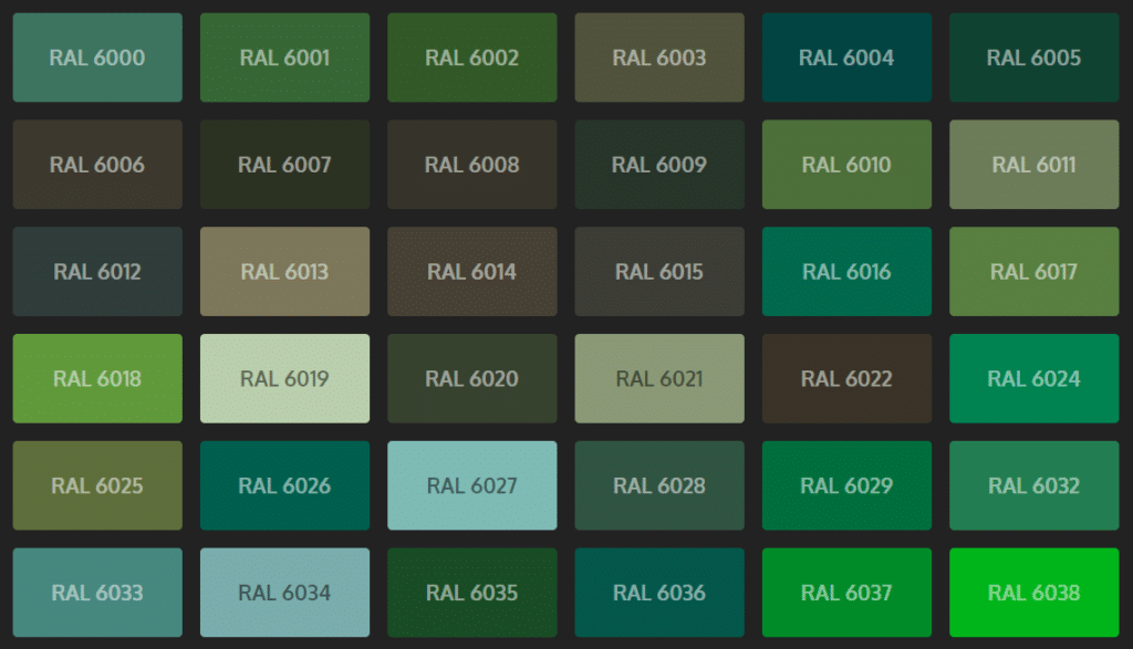
RAL is the colour matching system which European countries use to identify and standardise colours for paint, plastics and coatings. There are 2530 RAL colours currently which is actually less than Dulux have paint colours so expect some variation.
One of the benefits of RAl colours is that they cover more than just paint. Once you have a RAL colour you can also order vinyl, spray paint, plastic mouldings, even flooring.
RALcolorchart.com categorises all of the RAL colours into hues which you can then use to select your RAL colour and ask your paint supplier to match.
hextoral.com
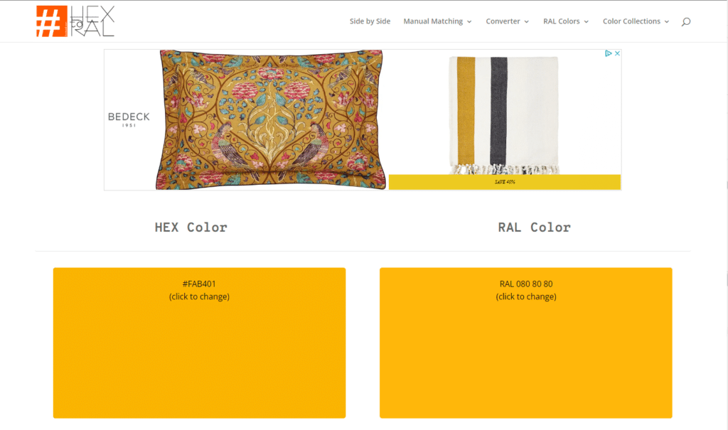
hextoral.com offers an automated version of, yes, you’ve guessed it, hex to RAL conversion. The colours are slightly more limited than the RALcolorchart website but it does also offer a manual search option to finetune the selection.
The Old Ways Are the Best...
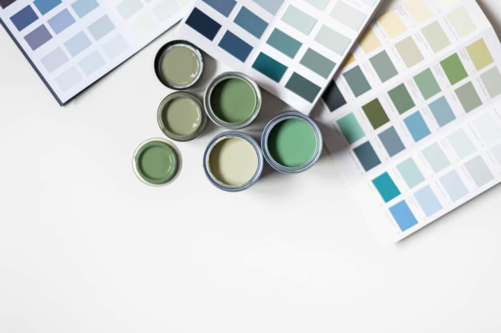
You can’t really beat a colour chart or trade fan deck when it comes to picking the paint for your colour scheme. Having a physical tool which you can use in the actual room you’re decorating is the best way to make sure you get the paint colour you really want. Many paint companies now also offer stick on swatches or large painted squares which you can use to assess how the colour works with the light in the space. It’s a great way to try before you buy.
If you want to see how the experts use a trade colour fan deck, watch our SkillsLab video featuring Dulux Creative Director Marianne Shillingford.
Up Next on Design 101:
In the next Design 101 we’ll be looking at choosing furnishings and flooring to work with your colour scheme. Sign up for our newsletter or follow us on Instagram for the next instalment.

